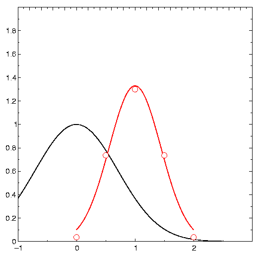
This example shows a few experimental points which roughly fit a
Gaussian function. First we do a function plot: We set the parameters of the Gaussian to some
initial values (parameter #0: amplitude, #2: offset, #3: width control).
Then we place a curve tag pair
containing the begin and the end of the abscissa range and request an
interpolation by a function. This gives the black curve.
Finally we place a curve tag pair containing the experimental data, requesting again an interpolation by (the same) function while fitting the parameters. The result is the red curve.
Note that the function is specified in "reverse
Polish notation": x,p1,-,2,^,p2,*,neg,exp,p0,*
Translation:
Place argument and parameter #1 onto stack, subtract,
place "2" onto stack, raise previous result to this power,
place parameter #2 onto stack and multiply, then change sign,
take the exponential,
place parameter #0 onto stack, multiply
Here is the diagram source code:
<!DOCTYPE cartesian SYSTEM
"$GRXHOME/inputs/cartesian.dtd" [
]>
<diagram>
<xaxis majorincr="1.0"
minorincr="0.5">
<xaxis y="ymax"
numbering="none">
<yaxis>
<yaxis x="xmax"
numbering="none">
<parameters>1.0 0.0 1.0</parameters>
<curve
pattern="solid" interpolation="function" symbol="none" function="x,p1
,-,2,^,p2,*,neg,exp,p0,*">-1.0
0.0
3.0 0.0</curve>
<curve
interpolation="function" symbol="circle" color="red" function="x,p1,-
,2,^,p2,*,neg,exp,p0,*"
fit="0,1,2">
0.0 0.036631
0.5 0.735759
1.0 1.3
1.5 0.735759
2.0 0.036631</curve>
</diagram>
